Argent Graphs
Argent Graphs are line graphs or bar graphs with a date/time scale as the X-axis:
To create your own Argent Graph, you need to specify the Performance Counters, Nodes to include, and various other options, described below
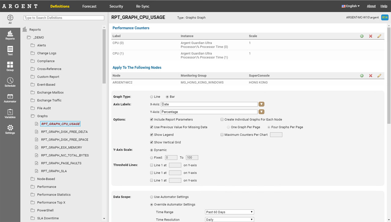
Performance Counters
These aren’t just for Windows — these include SNMP metrics, Linux/Unix metrics, VMware metrics, etc.
The entire process is filtered for you — choose the Product and Argent Reports will automatically filter out the Objects and Counters that are available in the Argent database
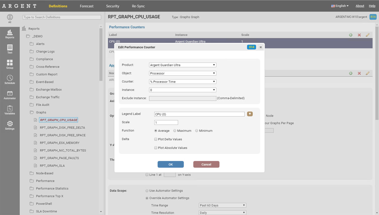
Legend Label
For each counter, specify a Legend Label — this controls how this counter should be displayed in the legend
This is particularly useful for SNMP metrics, where the Instance name of EXPR(1.3.6.147.5.4) is meaningless, but a Legend Label of Router Memory Usage is far more informative to humans
Scale
This useful feature allows you to multiply all retrieved values by a particular number
For example:
To convert “Bytes/sec” into “MBytes/sec”, you would set the scale to 0.000001
To convert “Service Level Agreement\SystemAlive” values as a percentage, set the scale to 100 (SystemAlive values are generated by System Down and SLA Rules, which return a 1 or a 0, depending on whether the node was down or not)
Function
All data is aggregated into “time buckets” based on the date range of the data
For example, for Past Hour or Past 6 Hours, the time bucket is 15 minutes
For Past Day, the time bucket is 1 hour
That means, we take all the data within each time bucket and we either do an Average, Maximum or Minimum of all data within each bucket, and boil it down to a single data point
Delta
This feature allows you to plot a graph of the change in the current and previous value
This is useful for disk space trending — to see how rapidly the rate of disk space consumption is occurring
Plot Delta Values can be positive or negative — which specify the direction of the change (e.g. positive = growth, negative = decay)
Plot Absolute Values forces all delta results to be positive — this is used for customers who aren’t interested in the direction per se, but rather the raw magnitude of the difference, regardless of whether it was growth or decay
X-Axis Label
This is the label for the X-Axis. For Argent Graphs, the X-Axis always shows the date
The label displayed, however, can be customized
Y-Axis Label
This is the label for the Y-Axis. This depends on what is being plotted
For example, a graph of CPU % should have “Percentage” or “% CPU” as the Y-Axis perhaps
Include Report Parameters
This option hides or shows the blue box in the report that shows the time zone, time range, special parameters and nodes
Use Previous Value For Missing Data
This option uses the previous data point’s value if the current data point has no data
This helps prevent detached line graphs caused by missing data to make it easier to identify trends
Show Vertical Grid
This option hides or shows the gray grid lines on the X-axis
Show Symbol On Each Data Point
This option hides or shows the symbols that highlight a data point on a graph. If these dots are obstructing the ability to view the graph itself, uncheck this option
Plot Thin Lines
By default, a graph will plot thin 1 pixel lines
Some graphs with sparse data points will look aesthetically better with thicker lines (3 pixel lines)
Show Legend
Option to show the legend under the graph or not
Y-Axis Scale
You can specify the range of the Y-Axis here
The ‘Dynamic’ option calculates the range automatically
The ‘Fixed’ option allows you to set your own minimum and maximum ranges
Threshold Lines
Customers can specify up to three threshold lines to appear on the graph at a certain Y-value
This is typically used to specify thresholds like ‘High’, ‘Medium’ or ‘Low’ – each threshold line has a unique color
Create Individual Graphs For Each Node
Instead of placing all counters for each node on the same graph, customers can have a separate graph for each node.
The size of each graph can be further controlled by choosing One Graph Per Page or Four Graphs Per Page
Maximum Counters Per Chart
Customers with many nodes and counters may want to split a single graph into multiple graphs based on the number of counters (or lines) on each graph.
A new graph will be added when the Maximum Counters Per Chart is reached.