KBI 312037 Enhancement: Implemented Dashboard Module In Argent Omega
Version
Argent Omega 2.2A-2301-A and above
Date
Friday, 13 January 2023
Summary
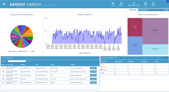
The Argent Omega dashboard shows real-time data from Argent Forecaster Data. It provides a quick view of the activities in the environment for the present day, present week, present month, and previous weeks and months, thereby enabling a user to take the necessary decisions and actions.
The Dashboard displays status summary information about your servers and devices. It consolidates small reports (known as “widgets”) into a summary page that displays status information about your servers and devices.
Technical Background
Dashboards provide instant visibility into your environment. The dashboards are customizable to suit the user’s perspective. Many such dashboards can be created by a single user.
The widgets display specific information that is illustrated in the form of a line graph, area graph, pie chart, bar chart, block chart, or flexible list. These widgets can be concealed and rearranged in the canvas.
With the drag and drop option, you can place the widgets in the dashboard according to your preference. The widgets most viewed or vital can be placed above all other widgets:
Creating New Dashboard
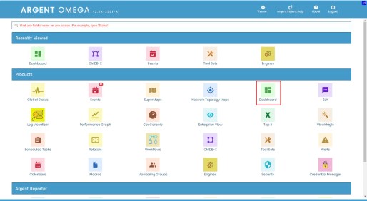
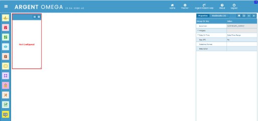
Click on the Dashboard home menu item to view and manage dashboards:
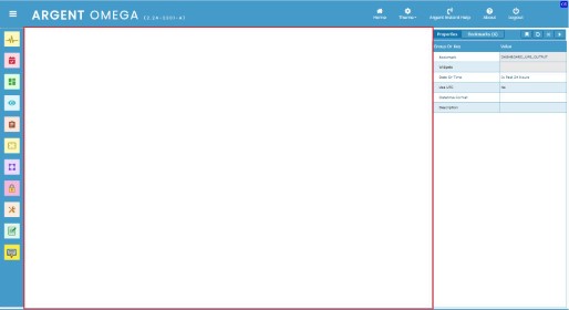
The following highlighted area is the dashboard canvas; there you can add and arrange out-of-the-box widgets:
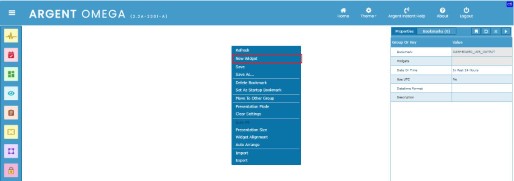
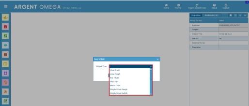
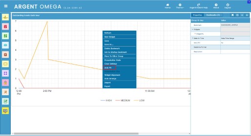
Click on New Widget context menu option to create a new widget:
There are many widget types available, and you can select the required one from the list:
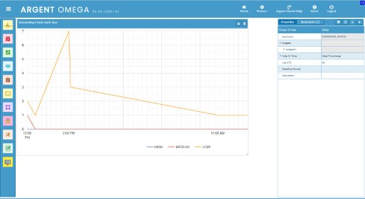
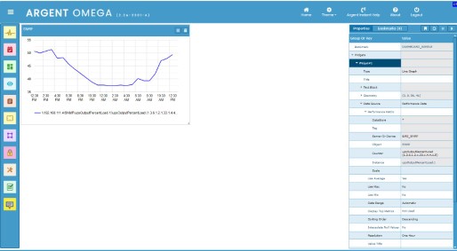
Below is an example of widget:
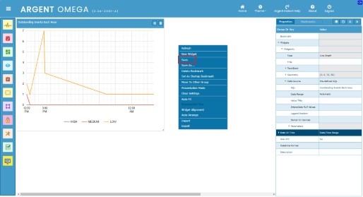
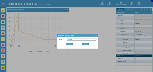
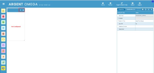
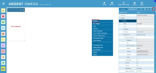
Click the Save context menu option to save the widgets in the dashboard:
Then specify a unique dashboard name and click OK:
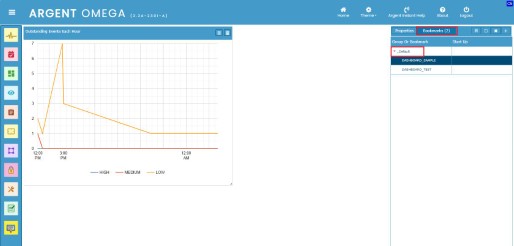
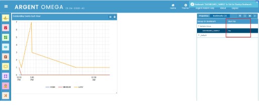
The dashboard will be saved as a bookmark. Click on the Bookmarks property tab to see all saved dashboards:
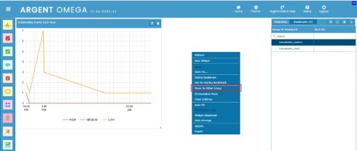
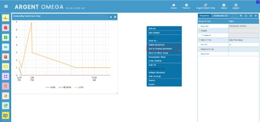
The bookmarks are organized in groups. The newly created dashboards are added to a default group named _Default. Click on the Move To Another Group context menu option to move the current dashboard to a new group:
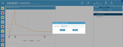
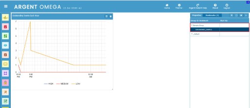
This will create a new group if the group with the specified name does not exist, and the dashboard will be moved to the new group:
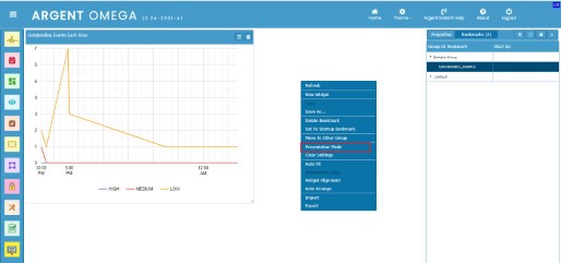
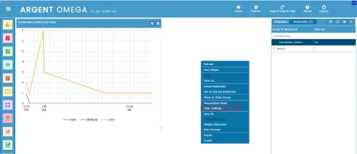
Click on Presentation Mode context menu option to see the dashboard in presentation view. This is a read-only mode, and you cannot add, modify, delete, or resize widgets:
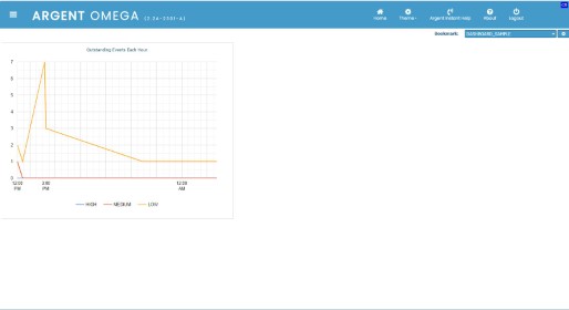
Following is the presentation view of the dashboard:
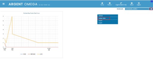
To switch to design mode, click the Design Mode button in the top right of click the Design Mode context menu option:
Click on the Delete Bookmark context menu option to delete the current dashboard:

Click on the Set as Startup Bookmark option to set the current dashboard as the startup dashboard. You will be landed on this dashboard page when you click the Dashboard home menu item:
The Clear Settings context menu option clears the entire canvas and gives you a fresh one for design:
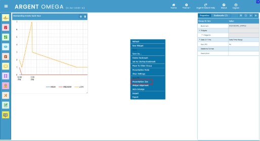
By default, the design mode does not allow placing widgets in the area covered by the right panel (property window). By clicking the Presentation Size context menu option, the design view provides the horizontal scroll bar to maintain the same size of the presentation area. So the size of the widgets in design mode is the same as the size in presentation mode. This helps to place widgets properly on the dashboard canvas:
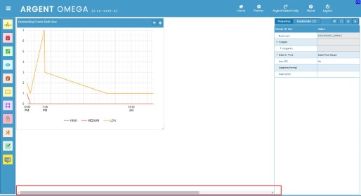
See the horizontal scroll bar in the bottom of the canvas after clicking the Presentation Size option:
By clicking the Auto Fit context menu option, the widgets are automatically fitted into the design mode canvas (the area excluding the property panel on right). When you switch to presentation mode, the design area is proportionally mapped into the presentation area (the whole canvas area including property panel on right):
After Auto Fit option is clicked:
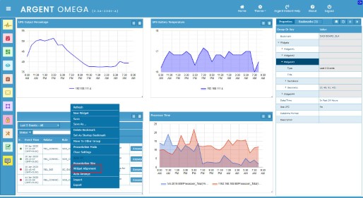
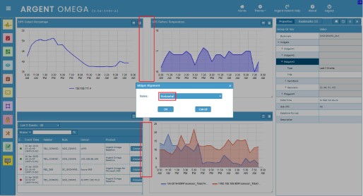
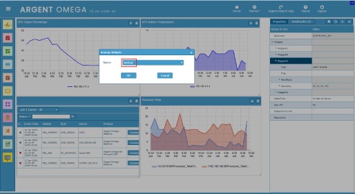
The Widget Alignment context menu option is used to align the widgets. This allows you to evenly position the widget horizontally or vertically.
Click on the Widget Alignment context menu option:
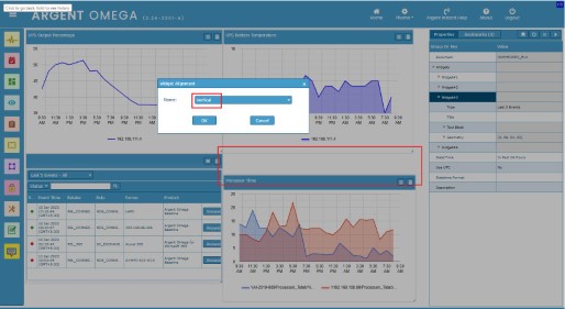
Then choose the type of alignment. None, Vertical, or Horizontal are the types. By default, it is None, meaning widgets are not aligned with other widgets on the canvas:
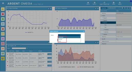
Select Horizontal option to align Widgets Horizontally:
Dashboard after widgets horizontally aligned:
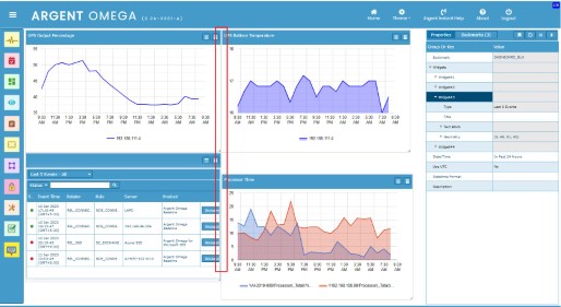
To align vertically, select Vertical option:
Dashboard after widgets vertically aligned:

The Auto Arrange context menu option enables you to arrange widgets horizontally or vertically without changing the size of widget:
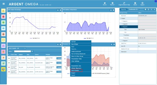
Select type of arrangement. It can be either horizontal or vertical:
Dashboard after widgets auto arranged vertically:
Dashboard after widgets auto arranged horizontally:
Dashboard Widgets
This section covers each type of widget available in the Argent Omega dashboard and its configuration.
To create a widget, click on the New Widget context menu item and select the required widget type from the list:
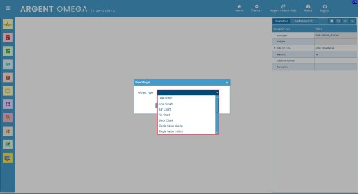
The following widget types are available in the Argent Omega dashboard:
- Line Graph
- Area Graph
- Bar Chart
- Pie Chart
- Block Chart
- Single Value Gauge
- Single Value Switch
- Text Gauge
- Data Table
- Super Console
- Last X Events
- Alerts By Criticality
- Event Map
- Geo Map
- Clock
A new widget will be added to the dashboard canvas:
The newly added widget need to be configured to display the information in it. There are buttons to configure and delete the widget. Click the Settings button to configure the widget. Click Remove Widget button to remove a widget from the dashboard canvas:
The configuration of each widget type is described below:
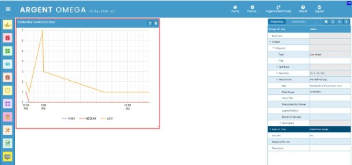
Line Graph Widget
Line Graph widgets are used to connect a series of performance data points with straight line segments.
It is one of the most useful types of charts to represent trends over time.
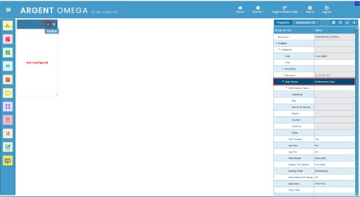
To create a Line Graph widget, click on the New Widget context menu option and select the Line Graph widget type from the list. Click the OK button to add the new line graph widget to the dashboard canvas.
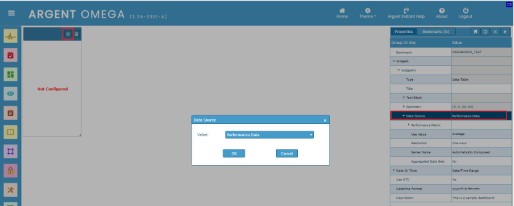
Click on the Settings button to configure the newly added Line Graph widget. You can also configure the widget by double-clicking the Data Source property in the property panel and choosing the Data Source from the popup dialog:
Argent Omega Performance Data is the default data source for a widget. You can also use pre-defined and custom SQL to query data from a SQL server to draw the graph in the Line Graph widget.
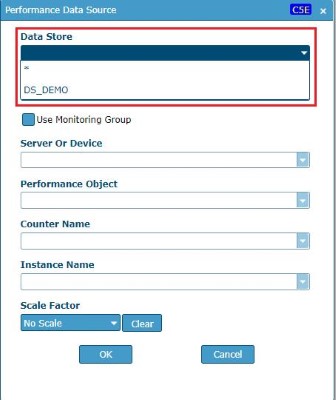
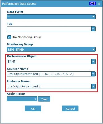
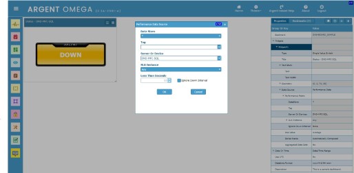
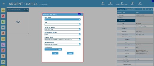
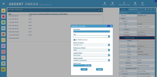
On clicking the Settings button on the newly added Line Graph widget, a popup dialogue named Performance Data Source appears. There you can configure the performance data of servers or devices, and that data will be plotted in the Line Graph widget:
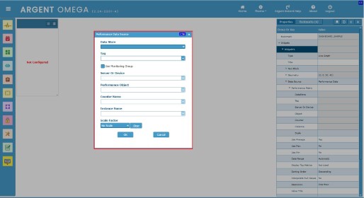
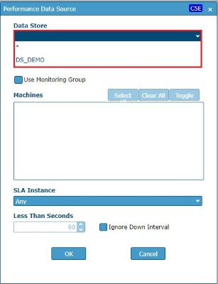
Select a Data Store for the performance data. All available data stores will be listed in the combo box.
Either you can select a particular data store or select “*” to use all available data stores:
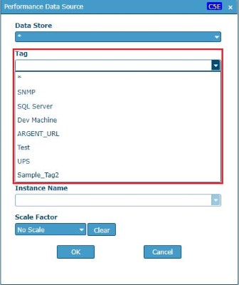
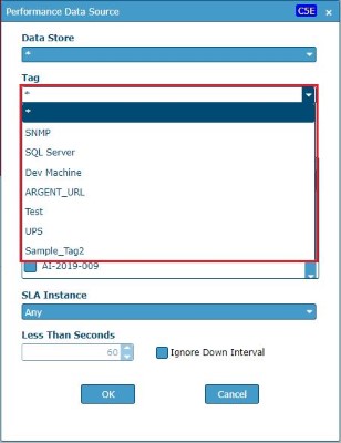
Select or specify the optional tag in the Tag combo box. The combo box will list all tags configured in the licensed nodes in CMDB-X. The nodes with the specified tags will only be listed in the Server Or Device combo box. Leave this field empty if you do not want to use the Tag field:
Use any of the following ways to choose the servers or devices for query performance data:
1. Choose the servers or devices directly from the Servers Or Devices combo box. All available performance data for selected servers or devices will be listed in Performance Object, Counter Name, and Instance Name fields:
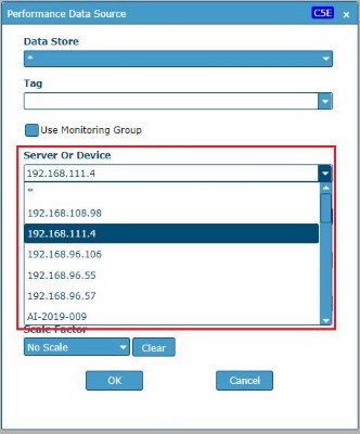
Select “*” to populate all available performance data in Performance Object, Counter Name, and Instance Name fields.
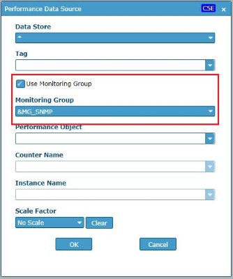
2. Check Use Monitoring Group check box and choose the required Monitoring Groups from the list. All available performance data for servers or devices configured in the selected Monitoring Groups will be listed:
Select the Performance Object, Counter Name, and Instance Name from the respective combo boxes. The metric values of the selected object, counter, and instance will be used to plot the line graph:
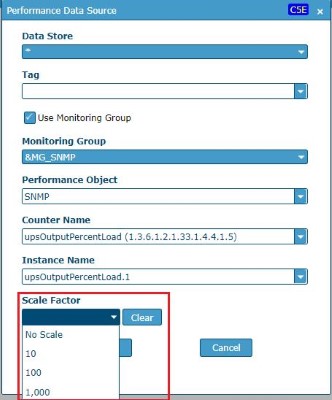
Choose the Scale Factor. The scale factor is the factor that is used as the factor by which line data is multiplied. Choose No Scale from the list if you do not want to use scaling:
Click the OK button in Performance Data Source dialog and click Refresh context menu option or refresh button in the property panel to display the line graph in widget:
The following highlighted properties are common for all widgets in a dashboard:
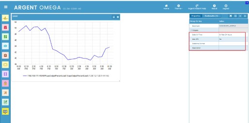
The Date Or Time property specifies the data or time range to collect the performance data. The data within the specified data or time range will be used by the widget.
Double click on the Date Or Time property to configure the same:
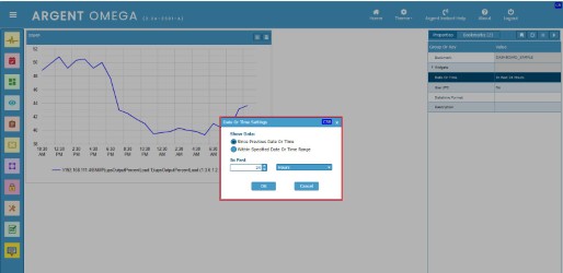
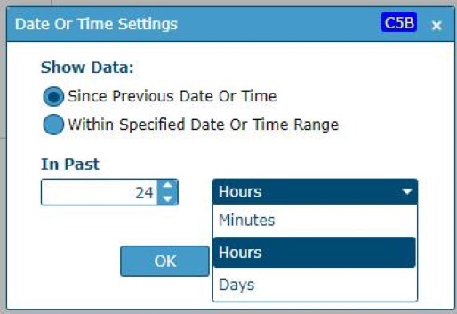
To use the data since a specific number of minutes, hours, or days, use the Since Previous Date Or Time option:
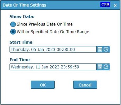
You can specify a date and time range using the Within Specified Date Or Time Range option:
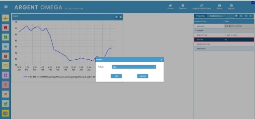
Set the property Use UTC to Yes, if the date time is taken as UTC:
To reflect the property change in the widget, click the Refresh context menu option or the refresh button in the top right corner of the property panel.
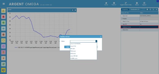
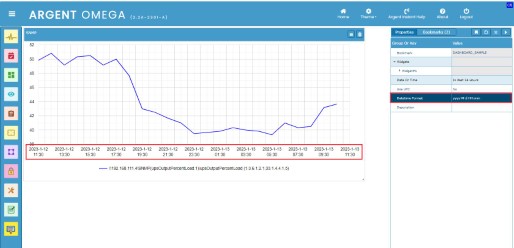
Choose the required data and time format from the Datetime Format property. The date and time values in the current dashboard widgets will be displayed in the selected format:
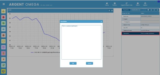
Specify dashboard description in Description property:
All widgets in a dashboard are listed under the Widgets property. The widgets in a dashboard are named as Widget #1, Widget #2, Widget #3, etc.
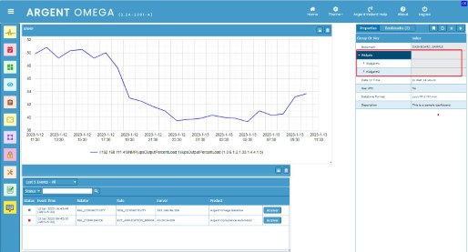
The Widget specific properties can be configured by expanding the widget name property:
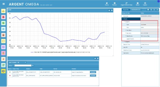
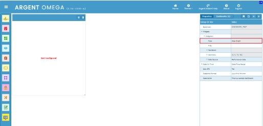
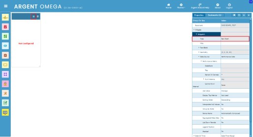
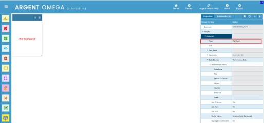
The read-only property Type specifies the Widget Type.
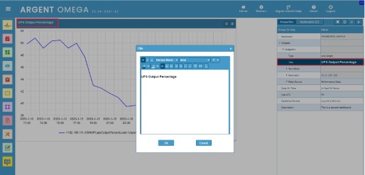
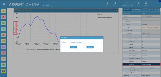
Title for the widget can be configured in Title property:
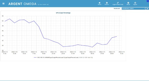
Title in Presentation Mode:
Specify chart text in the Text Block. Also specify the percentage of width should be occupied by the Text block:
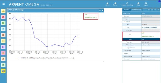
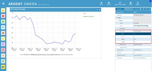
The chart’s left and right padding, width, and height are configurable in the Geometry property section:
Argent Omega Performance Data is the default data source for a widget. Configure the properties in the Data Source section to fine-tune the input performance data for easier presentation in the chart widget:
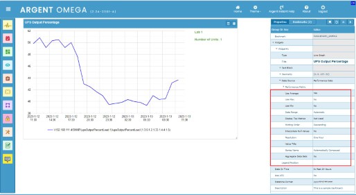
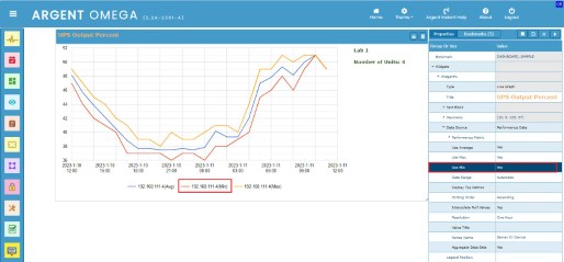
Set the Use Average property to Yes, if you want to use the average metric value (AVERVAL) of performance data for visual representation. Otherwise, it uses the last metric value (LASTVAL) of performance data.
Setting the Use Max property to Yes will add the line graph using the maximum metric value (MAXVAL) from performance data:
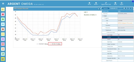
Setting the Use Min property to Yes will add the line graph using the minimum metric value (MINVAL) from forecaster data:
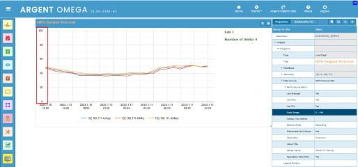
Double click the Data Range property to configure the minimum and maximum data point:
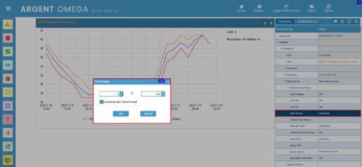
By default, the minimum and maximum values are automatically determined from forecaster data. To manually define the data range, uncheck Automatically Determined check option and specify the data range. Click the OK button to apply the changes:
By specifying the Display Top Metrics property, it automatically sorts the data from top to bottom and displays only the TOP “X” items.
The Sorting Order property specifies the sorting order used for top-X display.
Interpolate Null Values property controls how to display missing values. If it is Yes, there will be a line from the last available data point to the next available point; otherwise, there is a gap.
The Resolution property specifies the graph resolution.
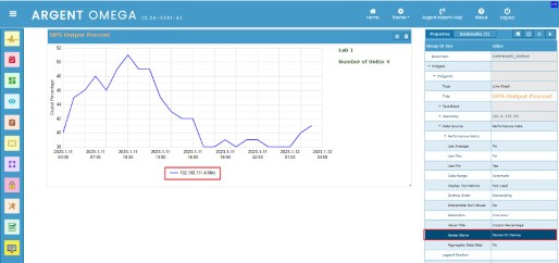
The Value Title property specifies y-axis title for its values:
Specify the Series Name property to label each line in a line graph widget. This tells what each line represents. Double click the property to configure the required series name:
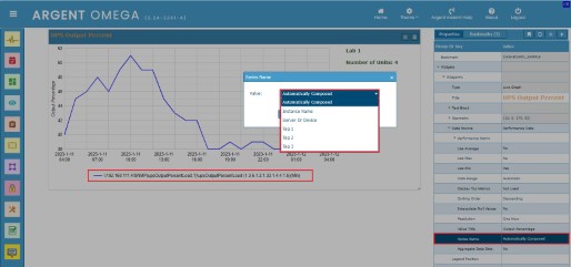
The Automatically Composed option is used by default to compose the series name for lines. The user can change it according to his or her requirements:
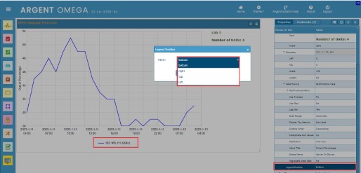
Configure the Legend Position property to position the Legend Entries (Series Names) in a Line Graph widget:
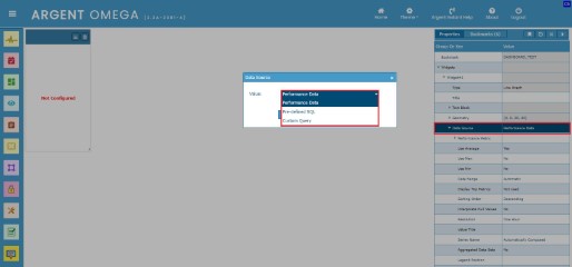
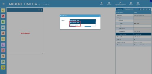
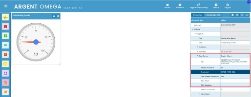
Other than the default Performance Data source, it is also possible to use Pre-defined SQL query results or Custom Query results as a data source for the line graph widget.
Double click the Data Source property to change the data source:
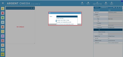
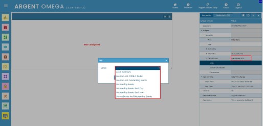
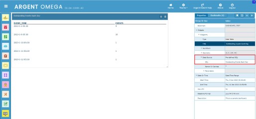
When using Pre-defined SQL as a data source, you need to select the required pre-defined SQL query in the SQL property. Double-click the SQL property to select the pre-defined SQL query from the available list:
Select the required one and press the refresh button to reflect the changes:
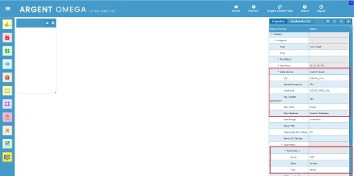
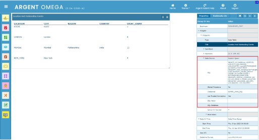
When using Custom Query as a data source, you need to specify the SQL query in the SQL property. The SQL Server Credential must also be specified. The specified query will be run on the SQL server, and the query result will be used as a data value in the widget to draw the graph:
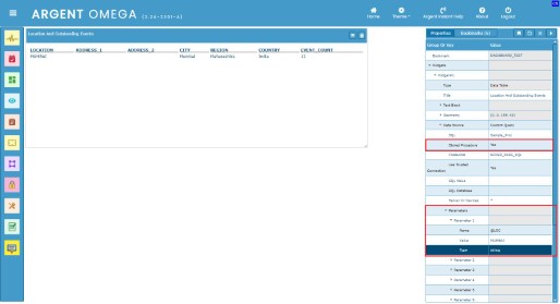
If the SQL query specified is a stored procedure, set Stored Procedure property as Yes. Also you can define the parameters for stored procedure in Parameters section:
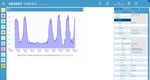
Area Graph Widget
An Area Graph widget is used to connect the value points with straight lines.
To create an Area Graph widget, click on the New Widget context menu option and select the Area Graph widget type from the list. Click the OK button to add the new area graph widget to the dashboard canvas:
The data source configuration of the area graph widget is the same as that described in the line graph widget section. Please see the section on line graph widgets:
Bar Chart Widget
The Bar Chart widget is used to display series of grouped data with rectangular bars, the size of which is proportional to the displayed data.
To create a Bar Chart widget, click on the New Widget context menu option and select the Bar Chart widget type from the list. Click the OK button to add the new Bar Chart widget to the dashboard canvas.
Click on the Settings button to configure the newly added Bar Graph widget. You can also configure the widget by double-clicking the Data Source property in the property panel and choosing the Data Source from the popup dialog:
Argent Omega Performance Data is the default data source for a widget. You can also use pre-defined and custom SQL to query data from a SQL server to display in Bar Chart widget.
On clicking the Settings button on the newly added Bar Chart widget, a popup dialogue named Performance Data Source appears. There you can configure the performance data of servers or devices:
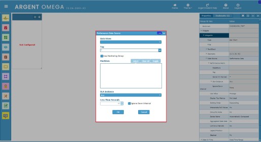
Select a Data Store for the performance data. All available data stores will be listed in the combo box. Either you can select a particular data store or select “*” to use all available data stores:
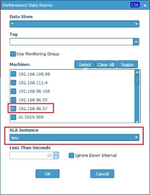
Select or specify the optional tag in the Tag combo box. The combo box will list all tags configured in the licensed nodes in CMDB-X. The nodes with the specified tags will only be listed in the Machines list box:
Leave this field empty if you do not want to use the Tag field.
Choose the Machines or Monitoring Group.
Choose SLA Instance:
Click the OK button in Performance Data Source dialog and click Refresh context menu option or refresh button in the property panel to display the bar chart:
Except for the Stacked property, the bar chart widget’s properties are identical to those of the line graph widget.
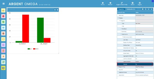
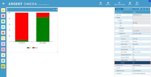
Specify the bar chart’s style in Stacked property.
When Stacked is No the bar chart looks like below:
When Stacked is Yes the bar chart looks like below:
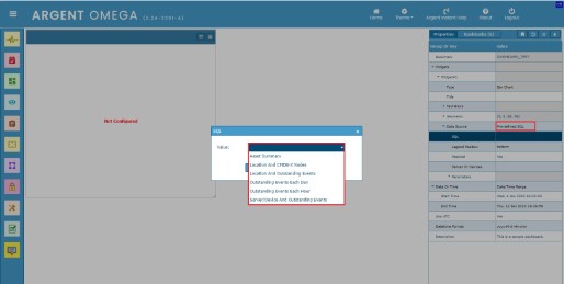
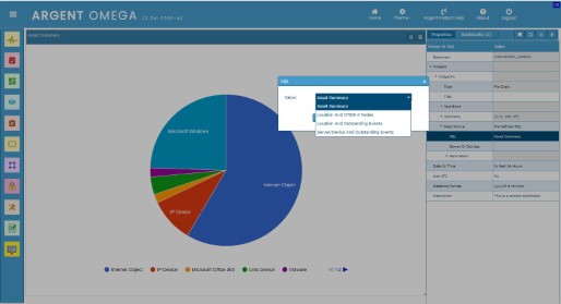
Bar chart provides following pre-defined SQL queries when using Pre-defined SQL as Data Source:
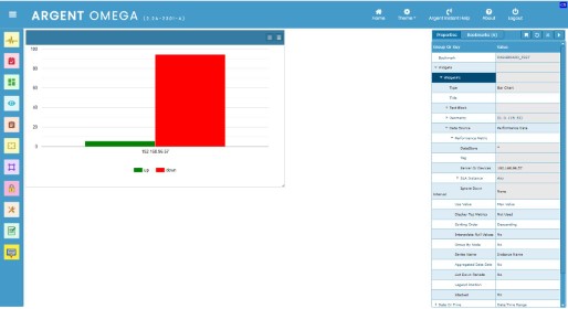
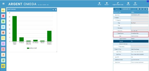
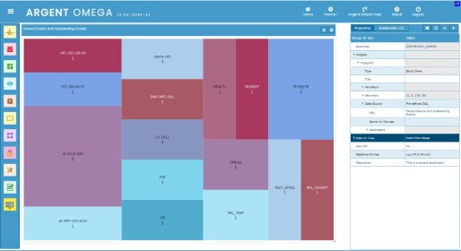
Following is the bar chart of Asset Summary pre-defined SQL:
Pie Chart Widget
A Pie Chart widget is used to display the data in a series as a circle divided into slices, where the area of each slice is proportional to the values of the series.
To create a Pie Chart widget, click on the New Widget context menu option and select the Pie Chart widget type from the list. Click the OK button to add the new Pie Chart widget to the dashboard canvas:
The data source configuration of the pie chart widget is the same as that described in the line graph widget section. Please see the section on line graph widgets:
Block Chart Widget
A Block Chart widget shows the relation between data values as blocks of varying area.
To create a Block Chart widget, click on the New Widget context menu option and select the Block Chart widget type from the list. Click the OK button to add the new Block Chart widget to the dashboard canvas.
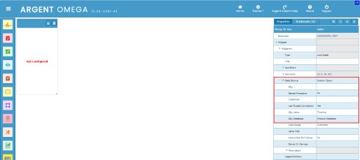
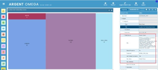
The block chart widget only takes input data from either Pre-defined SQL or Custom Query data source. Click the Settings button or double-click the Data Source property to configure the data source:
Following pre-defined SQL queries are available when Pre-defined SQL as data source:
When using Custom Query as a data source, specify the SQL query, credential, SQL value, etc.
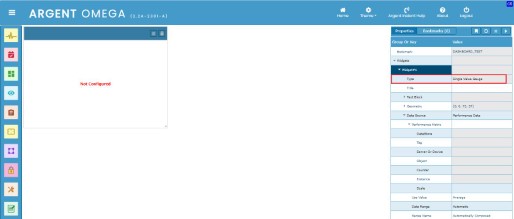
Single Value Gauge Widget
A Single Value Gauge widget is a simple status indicator that displays a needle that moves within a range of numbers displayed on its outside edges.
To create a single value gauge widget, click on the New Widget context menu option and select the Single Value Gauge widget type from the list. Click the OK button to add the new gauge widget to the dashboard canvas:
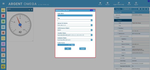
Click on the Settings button to configure the newly added Single Value Gauge widget. You can also configure the widget by double-clicking the Data Source property in the property panel and choosing the Data Source from the popup dialog.
Argent Omega Performance Data is the default data source for a widget. You can also use pre-defined and custom SQL to query data from a SQL server to display in a selected widget.
Configure the Performance Data Source:
Use existing pre-defined queries when Pre-defined SQL as data source:
Use custom SQL queries when using Custom Query as data source:
Single Value Switch Widget
A Single Value Switch widget displays the current status of a specific server or device.
To create a Single Value Switch widget, click on the New Widget context menu option and select the Single Value Switch widget type from the list. Click the OK button to add the new widget to the dashboard canvas.
Click on the Settings button to configure the newly added single value gauge widget. You can also configure the widget by double-clicking the Data Source property in the property panel and choosing the Data Source from the popup dialog.
Argent Omega Performance Data is the default data source for a widget. You can also use pre-defined and custom SQL to query data from a SQL server to display in a selected widget.
Configure the Performance Data Source:
Text Gauge Widget
A Text Gauge widget is used to visually represent a text or numeric quantity.
To create a Text Gauge widget, click on the New Widget context menu option and select the Text Gauge widget type from the list. Click the OK button to add the new gauge widget to the dashboard canvas.
Click on the Settings button to configure the performance data source:
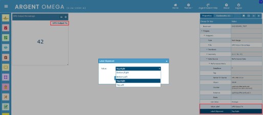
Specify a label for a value in Value Label property.
Specify the label position in Label Alignment property:
Use existing pre-defined queries when Pre-defined SQL as data source for Text Gauge:
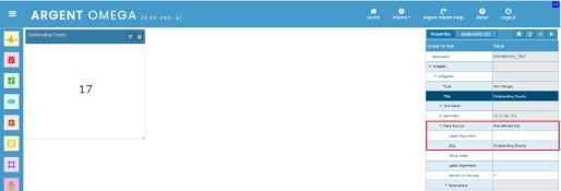
Data Table Widget
The Data Table widget is used to display data in tabular format. Use Performance Data, Pre-defined SQL, or a Custom Query as the data source for this widget.
To create a text gauge widget, click on the New Widget context menu option and select the Data Table widget type from the list. Click the OK button to add the new Data Table widget to the dashboard canvas.
Click on the Settings button or double-click the Data Source property to select the data source:
When Using the Performance Data as data source, double-click the Performance Metric property to configure the Performance Data Source:
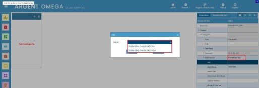
Following pre-defined SQL queries are available when Pre-Defined SQL is used as data source:
Select any query from the SQL combo box, and the result will be displayed in the Data Table Widget:
Select Custom Query as a data source to display the result of an SQL query in the Data Table widget. Then specify the SQL server credential and SQL query in the corresponding property fields:
Set Stored Procedure property value to Yes, if the specified SQL is a stored procedure. Specify the parameters for stored procedure in Parameters property section:
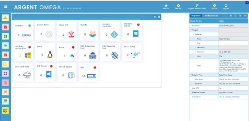
Super Console Widget
The Super Console widget delivers an overview status display of the entire environment. It presents a summary of the environment to the customer.
To create a Super Console widget, click on the New Widget context menu option and select the Super Console widget type from the list. Click the OK button to add the new Super Console widget to the dashboard canvas. The Super Console widget is pre-configured, and no other configuration is required to show the objects in it:
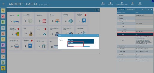
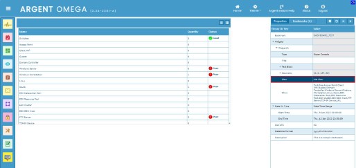
Change the view style by changing View property:
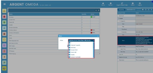
Include or exclude console items by configuring Show property:
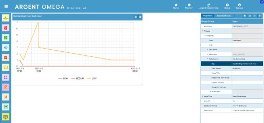
Last X Events Widget
The Last X Events widget shows the last five events that occurred in the environment. It lists the last five answered, unanswered, and resolved events.
To create a Last X Events widget, click on the New Widget context menu option and select the Last X Events widget type from the list. Click the OK button to add the new widget to the dashboard canvas. The Last X Events widget is pre-configured, and no other configuration is required to show last occurred events:
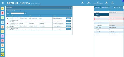
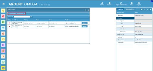
By default, the list contains Events with all statuses, that is, Answered, Unanswered, or Resolved. There is an option to further filter it:
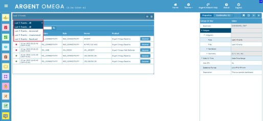
Following list shows unanswered Events only:
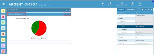
Alerts By Criticality Widget
The Alerts By Criticality widget shows the count of events by their critical levels, which are Low, Medium and Critical.
To create an Alerts By Criticality widget, click on the New Widget context menu option and select the Alerts By Criticality widget type from the list. Click the OK button to add the new widget to the dashboard canvas. The Alerts By Criticality widget is pre-configured, and no other configuration is required to show the list:
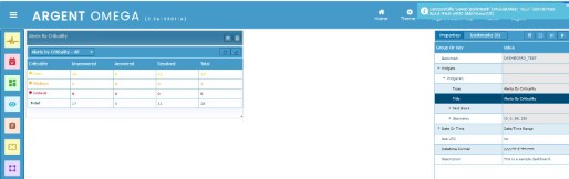
Filtering, refresh, and graphical display options are available:
Event Map Widget
The Event Map widget shows selected SuperMap. This widget presents the status of the entire enterprise in a graphical fashion.
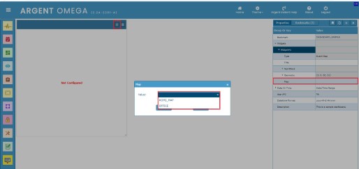
To create an Event Map widget, click on the New Widget context menu option and select the Event Map widget type from the list. Click the OK button to add the new widget to the dashboard canvas.
Click on the Settings button or double-click the Map property to select the SuperMap. It lists all available SuperMaps:
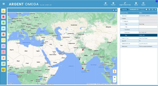
Each dot on the map is an individual server or device. The status of the represented item is displayed as red, orange, yellow, or green dots.
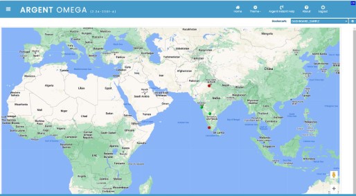
Event Map widget in Presentation Mode:
Geo Chart Widget
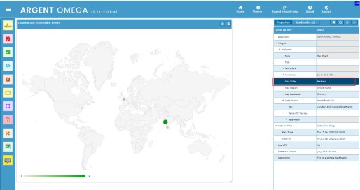
Use a Geo Chart to show a map of a country, continent, or region. The locations matches in the data values will be highlighted with different color in map. For example, map to show country wise outstanding events.
To create a Geo Map widget, click on the New Widget context menu option and select the Geo Map widget type from the list. Click the OK button to add the new widget to the dashboard canvas.
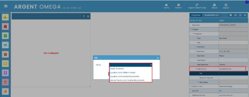
The Geo Chart widget only takes input data from either Pre-defined SQL or Custom Query data source.
Click the Settings button or double-click the Data Source property to configure the data source.
Select the SQL from the list when using Pre-Defined SQL as data source:
Configure the Map Style, Map Region and Map Resolution properties in the panel:
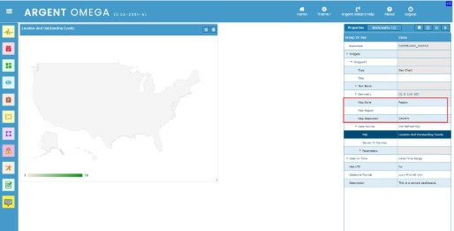
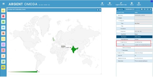
When using markers as Map Style:
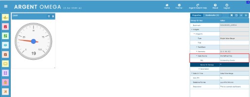
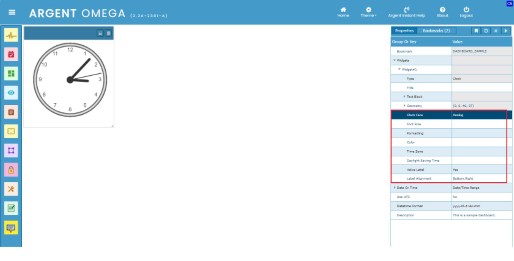
Clock Widget
The clock widget displays an analogue or digital clock in the time zone of your choice.
To create a Clock widget, click on the New Widget context menu option and select the Clock widget type from the list. Click the OK button to add the new clock widget to the dashboard canvas. By default, the clock widget shows an analogue face with local time.
Configure the following highlighted properties change the style of a Clock widget:
Switch face by configuring Clock Face property:
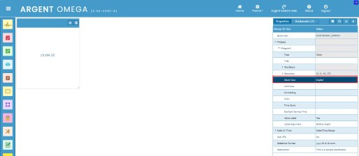
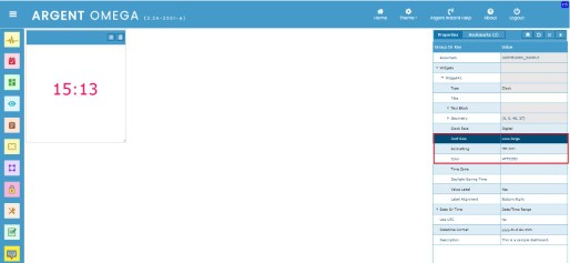
The Font Size, Formatting and Color properties are applicable only for clock with digital face:
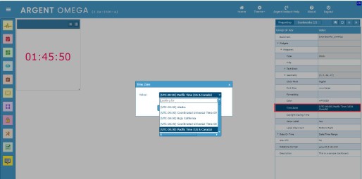
Change the Time Zone and Daylight Saving Time properties if required:
Resolution
Upgrade to Argent Omega 2.2A-2301-A or above